
How I Use Google Color Efex Pro
/Today’s photographer has so many options when it comes to photo editing software and then there are just as many (if not more) plugins available for those programs, finding the right choice for you can be daunting. With so many options available, how do you choose? Ultimately, how you want your photography to look is going to play a huge role in deciding. In this blog, I’ll discuss my editing process and why I choose Google Color Efex Pro (formerly Nik Color Efex 4) as my plugin of choice.
So first a little history and information about the editing software I use. I have been using Adobe Photoshop since version 7 came out a long time ago. I have used all the Creative Suite (CS) versions and I have primarily use Photoshop CS5 for my image editing and graphic design. Around 2007, I saw Adobe was beta testing a new photo-centric program called Lightroom and immediately jumped on board. I had debated buying Apple’s Aperture but Lightroom was much cheaper and much easier to use. Ever since, I have used all versions of Lightroom and currently use Lightroom 4. I don’t do many HDR photos anymore, but I have HDRSoft’s Photomatix Pro. For photo stitching and panoramas, I used a great program called PTGui for several years but have found that Photoshop / Bridge can handle all of my panoramas much easier and more intuitively. Lastly, I have a Nik Software’s Silver Efex 2 and Color Efex Pro plugins for Lightroom/Photoshop which are included in the free suite from Google that is linked above.
I started using Color Efex back in the spring of 2009, when I downloaded a trial version of Color Efex 3 as a plugin for Lightroom 3/4. I really didn’t use the plugin very much back then, I really just used it for touching up the contrast and occasionally for their graduated neutral density presets. In late 2011, I upgraded to Color Efex Pro 4 and I have been incorporating its tools into my image editing more and more ever since. In 2012, Google purchased Nik and has since made their entire lineup of products free for download. They are no longer being updated or supported by Google, but it's a pretty awesome deal to get their whole product suite for free. Go here to download Google Color Efex Pro and others.
The great thing about using their products as a plugin is that I can import the photos in Lightroom like normal, apply all my pre-editing presets (no sharpening, applying a lens profile, and removing chromatic aberrations) and then I can open that photo in Color Efex 4 without having to save or export a photo. The convenience is awesome, and never having to “leave” Lightroom is a huge bonus. So how does Color Efex help my photography?
First and I want to stress this, software will not make you a better photographer. Using software can enhance your photos in the way that you want your photos to look, but do not rely on software to save your photos. Do everything in your ability to use techniques and skills to make an awesome photo with your camera, and use software to enhance. I’m not limiting what you can do with software, photography is an art form and your editing preference is going to be different than my own. Disclaimer out of the way, let’s get into it.
Below is going to be a step by step process of how I edited one of my photos that I took in Grand Teton National Park back in 2010 on my first visit to that beautiful park. This will give you a little insight to what you can do with Color Efex and how I use the program. Without further ado, let's see what an unedited photo looks like when I first open it in Color Efex. The settings I'm using are as follows; 300 dpi, ProPhoto RGB.

The photo is a good one, but it's a little dark and it's flat. There isn't much contrast with the image so that'll be the first edit I'll make. By opening "Pro Contrast" under the "Landscape" menu, I can adjust to my liking.

I use a fair amount of "dynamic contrast" because I've always liked how it handles the contrast in images. The whites start popping more as the colors deepen to my liking, then I also adjust the "correct color cast" because the unedited was very blue so I added some warmth in there with that slider. Next I went with the "Polarization" filter which mimics the usage of a polarizer filter which I was not using when I took the picture. Also, when you get done working with a filter and want to apply it, you'll need to click "add filter" over on the right panel. I didn't know that for a while after I purchased this program back in 2009.

With the polarization filter in Color Efex, you can "rotate" the filter and adjust its strength which is making the sky darker/lighter depending on the settings. I wanted a nice gradient from lighter on the horizon to darker at the top of the photo. I've always felt that doing this helps draw the eye to the lighter section which is where the mountains are and ultimately where I want the eye to "go". Next up was using the "Brilliance | Warmth" filter. I don't know why I didn't highlight the filter locations with red before, but they are now going to be highlighted.

This where the first "big" change happens to the image, I adjusted the colors quite a bit to warm up the image especially in the mountain peaks. I use the "perceptual saturation" slider to allow the algorithm to decide what the "perception" of the image should be and where there should be more saturation. You can see that I warmed the photo up by 21% and I increased the overall saturation by 1%. I'm starting to get pleased with the settings and the image overall, but there need to be a few more small adjustments. I'll be using the "Skylight Filter" next to further warm up the image.

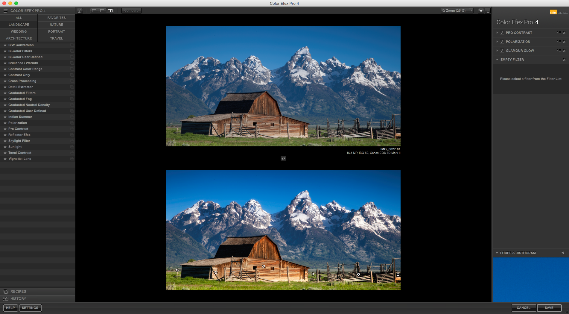
The Skylight Filter adds warm light to a photo and I wanted the barn to be warmer here and the image overall, so I did a small adjustment at 21%. The slider is already at 20% when you open the filter. Not much more to say about that, it's a useful filter to add some "sunlight" to a picture, this can be helpful if you are taking pictures at sunrise/sunset in particular. Next was a little bit of a departure from my normal editing process and I added some "Glamour Glow" to this to smooth out the saturation and add a bit of a "dreamy" feel. You'll be able to find this filter under the "Portrait" section of the menu on the left panel.

You can see the effect is quite strong in the mountains above the barn but everything has a little bit more of a nice glow and I was pretty happy with the settings I use, but I only wanted the mountains to receive the effect and didn't want the barn, wood, or grass to have that effect. On the right panel where it says "Control Points", I clicked the minus symbol and placed it where I wanted to remove the effect. Then I duplicated that filter in a row of minus filter across the bottom of the screen to remove that effect from the foreground.

In the above screenshot, you can see how big I wanted the filter to be and where I placed the 6 control points to remove that dreamy look from the foreground. At this point, I'm very happy with the resulting image and I'm done using Google Color Efex Pro with this image. This is a very intuitive photo editor with good filters, good effects, and an easy to use interface. Even without finer adjustments that I would make in Photoshop, this image is ready to be posted. Below you can see a before and after, which the after makes the before look like a flat, cold, landscape image in comparison.
Since this application is free with Google, you should absolutely go download Google Color Efex Pro and the other programs in the suite too. They are solid image editing/adjusting applications and can be easily integrated into Adobe Lightroom Classic CC or Photoshop CC.
The follow are some of the most used landscape filters that I use and I have learned these effects by editing hundreds of photos in Color Efex Pro, go download it and experiment with your photos. I bet you'll find it beneficial for your photography editing process.
- Pro Contrast
- Graduated Neutral Density
- Brilliance/Warmth
- Polarization
- Skylight Filter
Sometimes I use more or less of a certain filter or choose not to use one at all, but for most editing purposes that is the order in which I approach a photo. I love photos with a good deal of contrast, but I still want details showing up in the highlights and shadows so I do not go crazy. The Dynamic Contrast slider is awesome, as it can really enhance the contrast of a photo in a natural way and can be very helpful. Sometimes I use the B/W Conversion too, but I also have Silver Efex 2 so I normally use that to do all my black and white conversions. An example of using black and white conversion is below.
For landscape photography purposes, adjusting sliders is how I get close to what I want. The beauty of Google / NIk Software is how to built the ability to add control points to a photo to have even more control over the editing of photos and achieving the look that you are hoping to get. I will go into more detail about adding control points in another blog, but I use these tools to get about 80% done with image editing. The other 20% comes from using masks and adjustment layers in Photoshop. There are loads of instructions out there for gaining knowledge of using masks in Photoshop, and I can offer a review of a great resource soon. Chip Phillips, who is a phenomenally talented landscape photographer put together a series of videos last year that has helped immensely with my knowledge of Photoshop and how I edit photos. You can buy those videos on his website.
Thank you for reading, I hope my information was helpful and provided a good review of some of the features found in Google Color Efex Pro and how I use that plugin. If you have any questions, please contact me or ask below in the comments. I always reply to comments as quickly as possible.
